After making a figure with your favorite software—matplotlib, R, Matlab, gnuplot, etc.—there are usually many details that could need a touch-up. In collaborations, somehow that’s usually my job. Maybe partly because I’ve been using Illustrator since I-forgot-when, so I acquired some speed. I also love graphic design and am teaching scientific visualization (two areas with much less overlap than ideal).
This blog post is to show what I do by improving a scatterplot of the Iris flower data (a textbook example in statistics and machine learning). The purpose is not to make advertisements for Adobe. There is plenty of other vector graphics software. The purpose is not to show how I do it (there are tutorials for that, but above all, you need working experience). The purpose is not to teach some simple principles . . or OK, that’s easy because there are just two:
- Make plots that look like everyone else’s—because sticking to the convention facilitates understanding and highlights the data over the visualization itself.
- Make plots that don’t look like everyone else’s—because you want to stand out, make people remember, and pay attention.
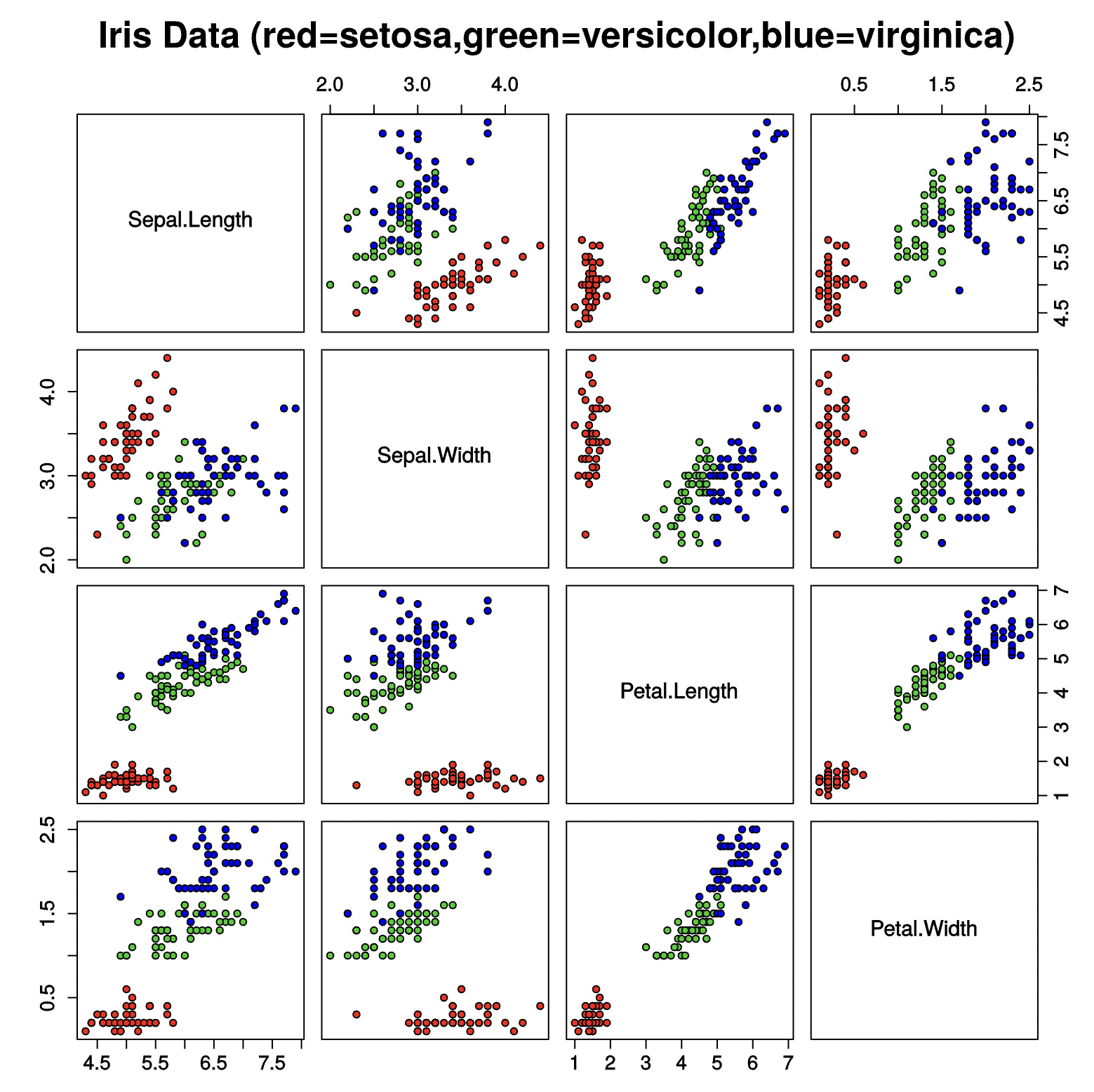
Rather, the purpose here is just to say what I do, starting from this Wikipedia figure by someone:
So, this is what I did:
- Deleting empty frames and unnecessary bounding boxes
- Deleting unnecessary white backgrounds
- Making layers: Text, frames, data points.
- Replacing outlined symbols (representing glyphs/text) with text. Changed the font to Myriad in the process. That’s just temporary.
- Deleting the “legend” (will insert a decent one later)
- Deleting the “.0” . . I mean what is it even supposed to mean? It’s not showing measurement accuracy. So in the name of keeping it simple, go away.
- Moving the (bizarre) scales with only 0.5 tick marks. 4.5, 5.5, 6.5 -> 4, 5, 6
- Fixing typos, superfluous dots, missing spaces.
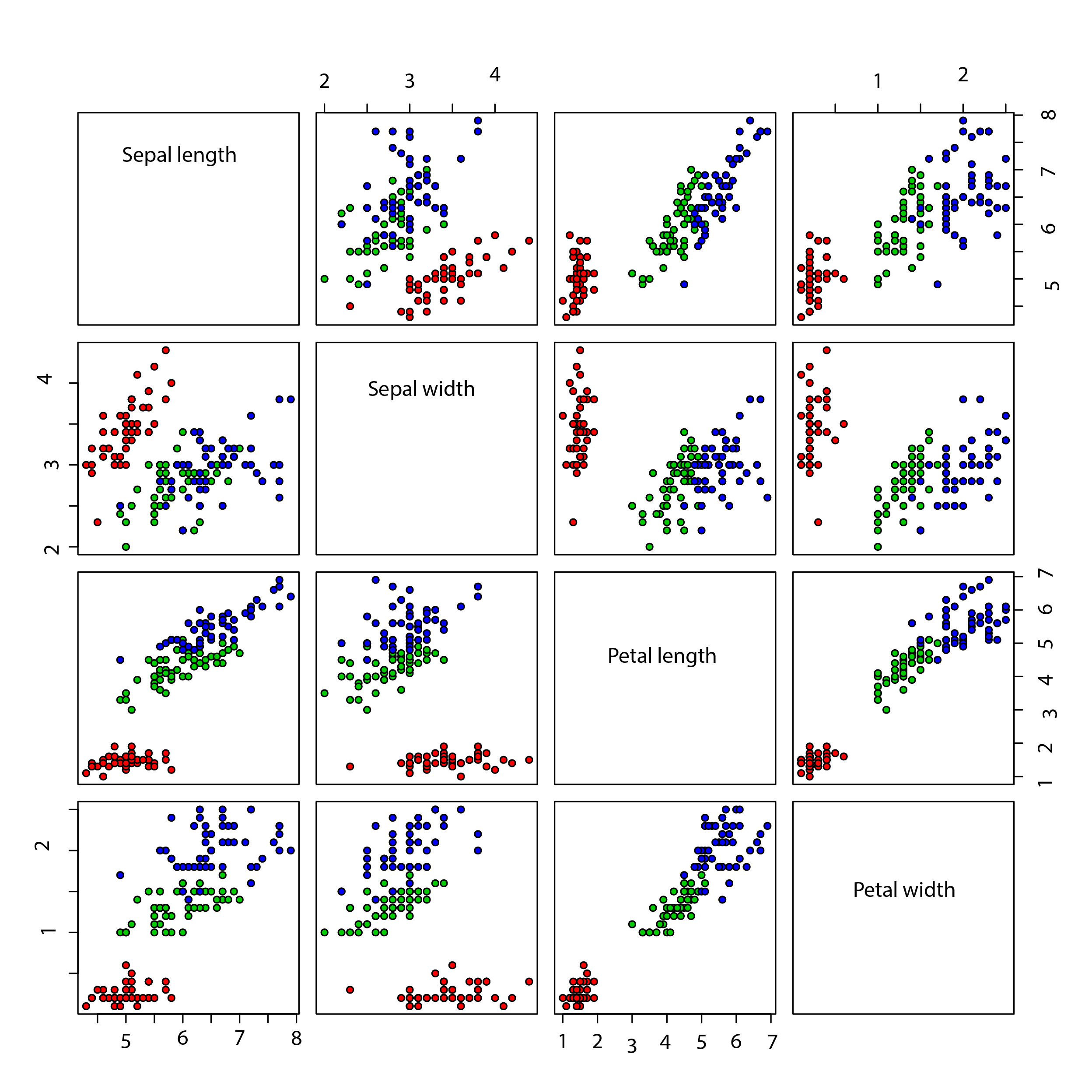
- Wait! Whut?!! The panels on either side of the diagonal are identical (after rotating and mirroring). What a horrible redundancy! Delete them in the Name of Tufte.
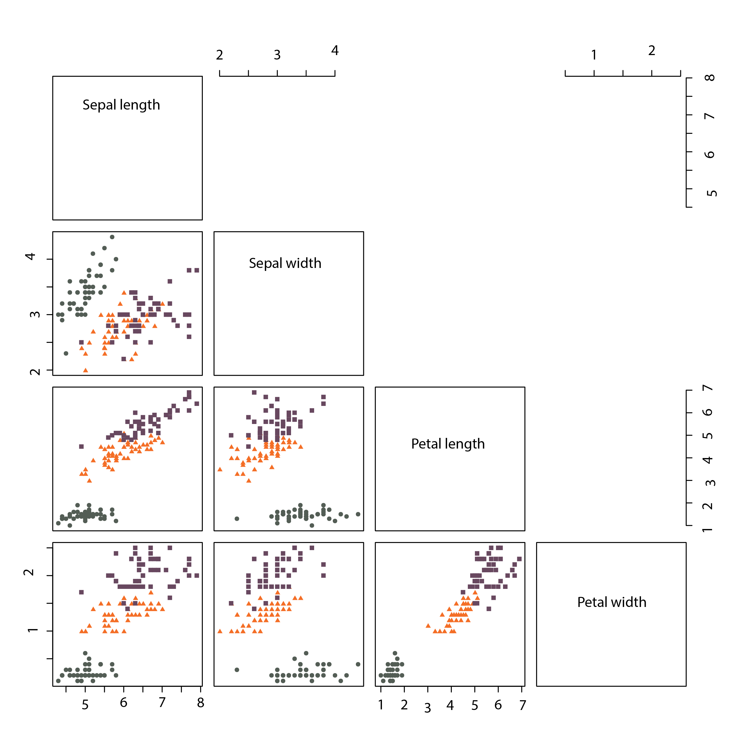
- Picking a color scheme. First I’m trying Chromotome’s rag-belur. A good color scheme should be easily separable (ideally for colorblind people and in b/w rendering although the latter is maybe not the highest priority, because obviously it is disrespectful to print/display a figure in b/w, and why should I be nice to someone who doesn’t respect me). (The previous palette—RGB FF0000, 00FF00, 0000FF—is probably not good for the colorblind.)
But that is just the beginning of the considerations! The colors of your plots say something about you, and it’s a way to express something beyond the plot itself. You might object: “Your ridiculous! Just overthinking stuff. Just go for a standard color scheme. We’re visualizing scientific information, not designing a turtleneck sweater.” And you’re completely correct, to people like yourself. But to overthinking people, choosing a default palette is saying (in a patronizing voice) “I’m not overthinking colors, and neither should you!”
So what does that rag-belur say about me? Hmm, I’ll leave that to the beholder. The Chromotome palettes, in general, give me nostalgic feelings—vibes of retrofuturistic furniture shops of Stockholm in the 1990s.
One last no-no. Don’t try to pack information about the data into the colors. Letting different shades of purple represent the data points (because they are irises of different shades of purple), etc.
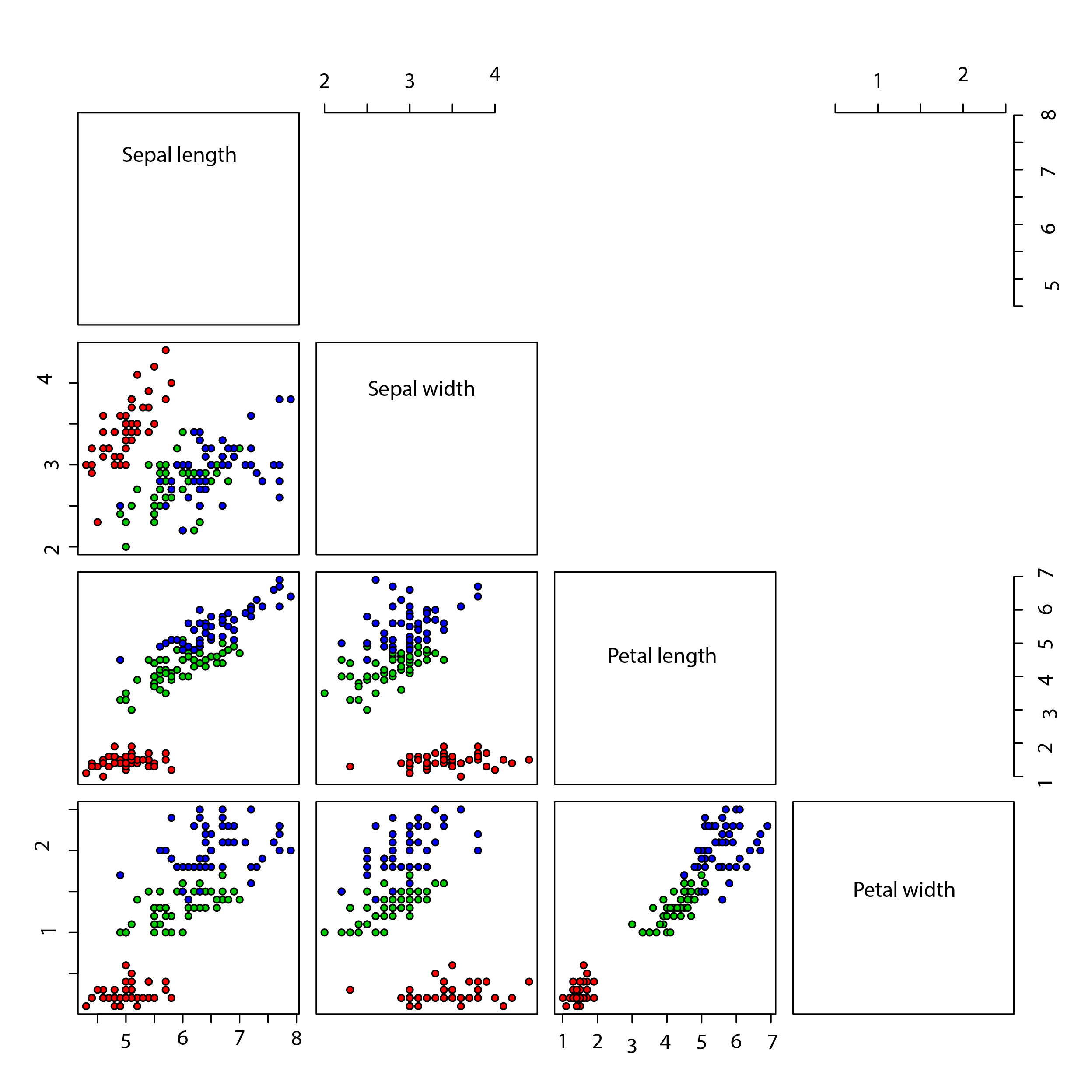
Finally, if one knows the context of the figure. How it will appear on a page, presentation slide, or poster, influences the choice too. Essentially matching the other colors will give a good impression, but put less visual stress on the figure. - Removing the black borders of the symbols.
- (In Illustrator terminology) letting data points be represented as symbols rather than objects. Change shapes from only circles to circles, triangles, and squares (because it makes different types of points easier to distinguish).
- Adding some transparency. (Thus increasing the information content!)
- Using butt cap / miter join (because why wouldn’t you want squares to be square).
- Oh, now I realize the panel frames are represented as open polygons, not closed. Fixed that.
- Changing the font to Apparat Semi Condensed. Choosing a typeface is a bit like choosing a color scheme—not choosing is also a choice. If the figure is to be surrounded by text, then by all means choose the same font.* Perhaps another weight or variant, but the same family. Of course, use proportional lining for numbers on the axes (or in general—use the font for what it is designed to do).
* The only exception I can imagine is if that font would reduce the readability. Then again, if it would, what’s really going on here? And, well, for this exercise, I will also skip thinking about the larger context. - Increasing the font size a bit. Essentially, that should also match the surrounding text. I can’t think of a case where very different font sizes in the same figure would look good (still, I see that a lot).

- Making the panels square (they had a 100:97 aspect ratio before). In Illustrator, you’d first rescale the entire area, then scale back symbols and tick marks.
- Connecting the axes of different dimensions / features. I want to show how the x-axes in some plots become the y-axes in others. Moreover, make things more continuous. The way the original figure alternated the locations of the numbers on the axes was mysterious. Moreover, it’s obviously better to have the numbers close to the name of the feature.
- Using a background color to distinguish the panels to make the black lines less dominant. Whether or not this will look good in the end depends a lot on the context of the figure on the page. If you can’t use the same design elsewhere, it is probably a bad idea.
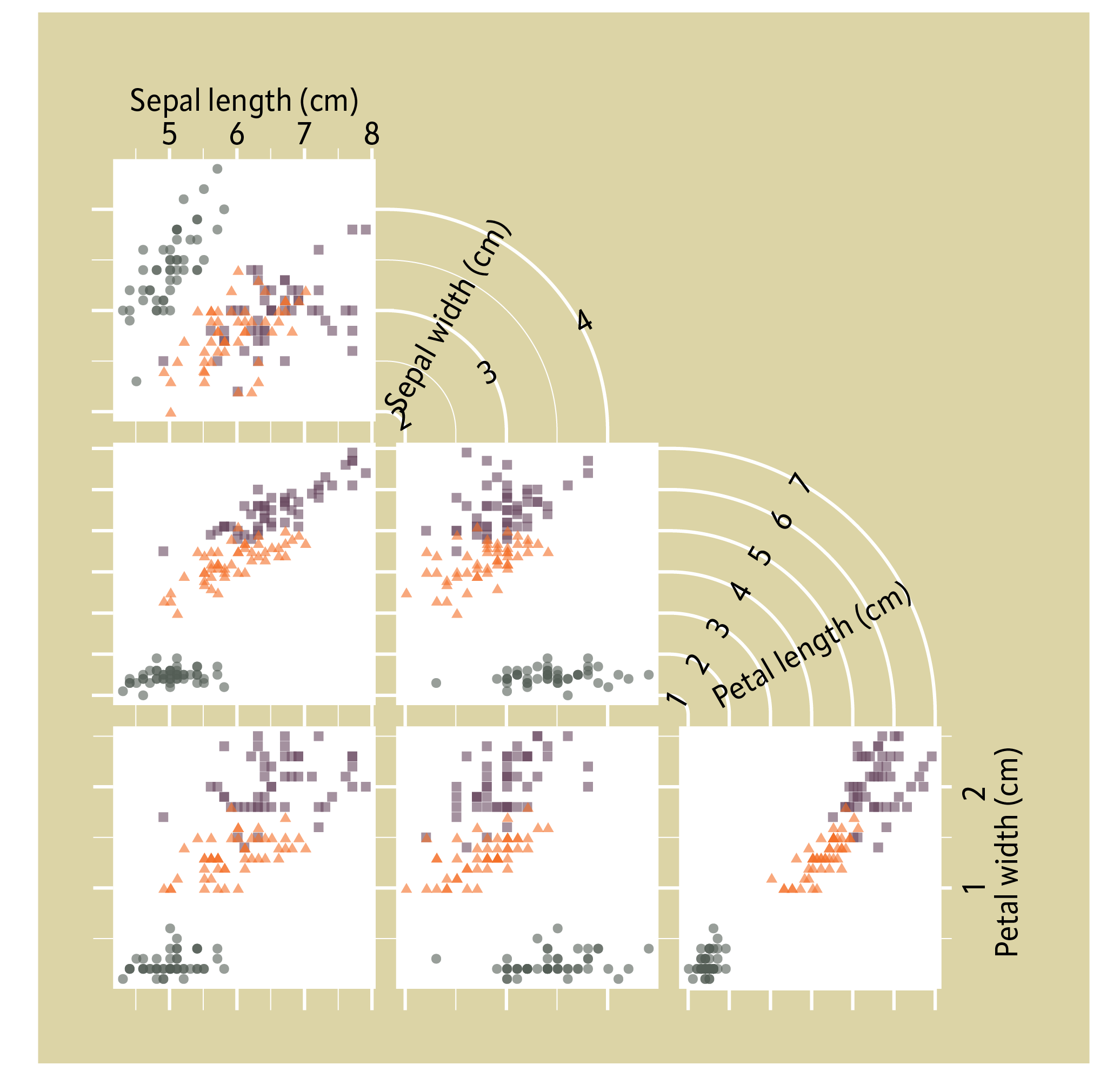
- Experimenting with different colors of tick marks to make it easier to separate the lines. Now the widths are black and the lengths white.
- Adjusting and aligning. Changing the order of numbers and description for “petal length.” I was overthinking it.
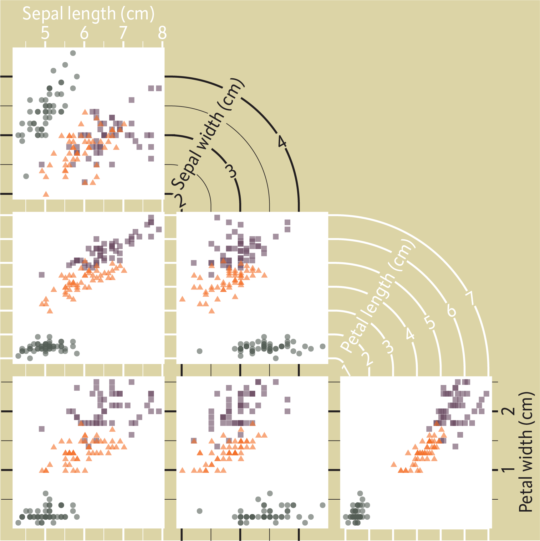
- Making the background darker (for contrast with the white text). For print probably the previous background would be better.
- Adding legend. The idea with the wavy shape is that the bent tick-lines (looking like a running track) are so dominant that it’s better to use them for the rest of the design than sweeping them under the rug.
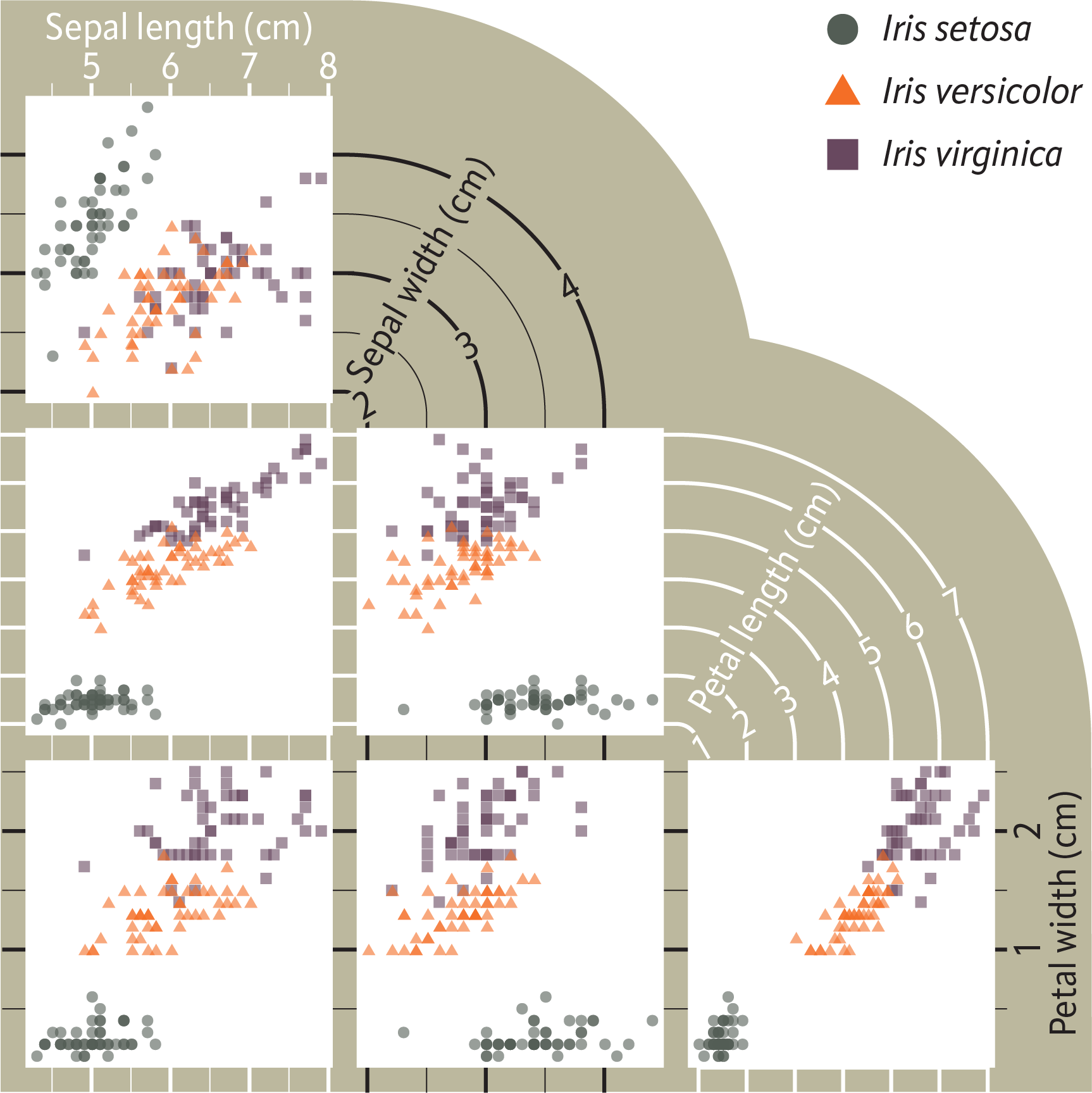
And voilà, a delectable creation ready to serve to your waiting guests.
